-
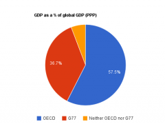
How well-represented is the average person, or the average dollar?
Consider the three pie charts below, which show (1) the percentage of NGOs at the UN headquartered in OECD nations, G77 nations, or nations that are neither OECD nor G77 members against (2) the percentage of world population living in each group and (3) the percentage of world GDP (by […]
-
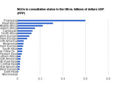
How Much Does Your GDP Matter for UN Representation?
This chart shows how many NGOs a region (UN Geoscheme) has in consultative status to the UN for every billion dollars of GDP (purchasing-power parity) it produces.
-
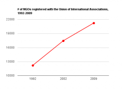
Global Civil Society on the Rise
This simple chart shows the approximate trend in the overall “population” of global NGOs over the past few years.
-
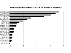
How many NGOs with consultative status to the UN does each region have per million inhabitants?
This bar graph compares the representation of different regions at the UN, in terms of NGOs with consultative status, for the citizens of different regions (UN Geoscheme-defined regions).

